BluLabel Daily Deals iPhone Apps
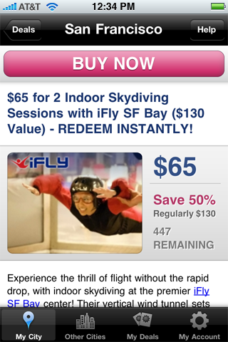
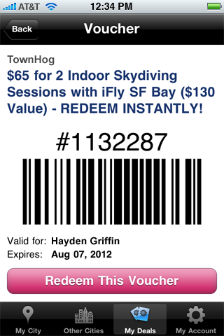
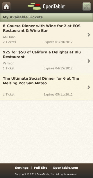
This series of iPhone apps offered access to the various daily deal sites powered by the BluLabel platform, including sites run by the San Francisco Chronicle and Cumulus Media. Round trip functionality, from deal browsing and purchase to point-of-sale redemption at local merchant’s locations were incorporated into the app. The app was designed from the ground up to gracefully accommodate the various visual styles requested by white label partners.
See more in Web and Digital Commerce
American Decorative Arts Forum Website
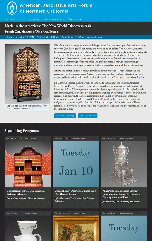
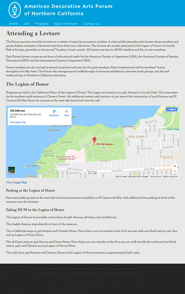
The American Decorative Arts Forum of Northern California—an support group of the Fine Arts Museums of San Francisco—commissioned me to completely redesign their website. The new site incorporates information about the Forum, detailed content and images relating to their monthly lecture program, an archive of past programs, information about joining the forum and attending their programs. All of this is contained in a custom designed, easy to use content management system that allows posting and editing of content with no technical coding knowledge required.
The aesthetic of the site is designed to reflect the rich artistic heritage of American decorative arts and the elegance of classical printing while allowing the beauty of each of the individual topics — focusing on a certain era, maker, or style — to shine through. The new site has received praise from museum curators across the nation, and has assisted in recruiting top-level speakers to travel to San Francisco to speak to the Forum.
OpenTable Spotlight Mobile Website
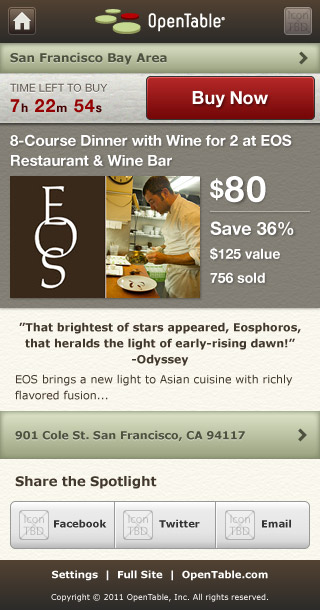
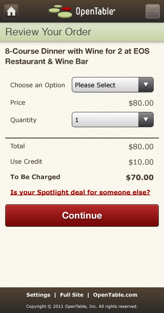
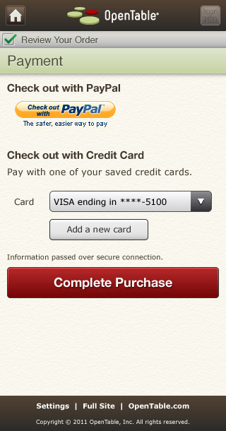
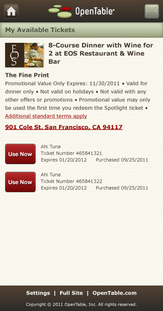
I created this set of design explorations to help OpenTable envision a mobile-optimized version of Spotlight, their restaurant deal service. Working from initial suggestions provided by their in-house design team I mapped out the full extent of features, content, and interactions that would need to be supported in order to maintain appropriate parity with the desktop version of the deals site and how to incorporate those features into their mobile reservation making service. The visual cues that informed the design were taken from the main website and enhanced with tactile and material styling appropriate to a touch-based interface. All the mockups were created in vectors to facilitate easy translation into final code for both standard and high-resolution mobile devices.
See more in Web and Digital Commerce
Syndication Engine Illustration
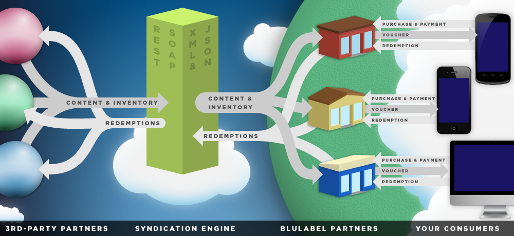
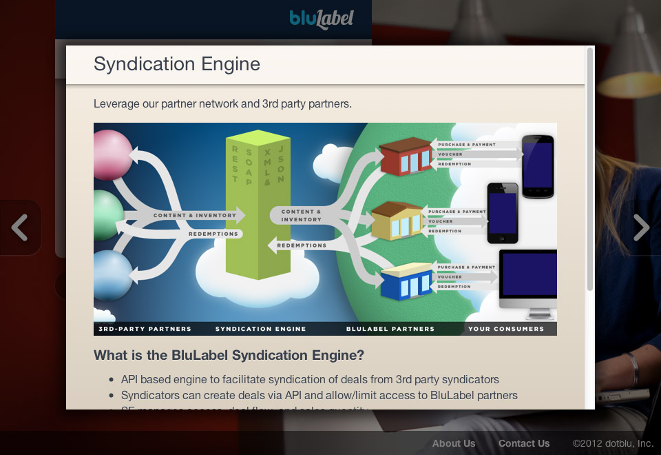
This diagram illustrates the players, communication channels, and publish-to-redemption flow of BluLabel’s daily deal syndication engine. The diagram gives an easy to understand overview of a complex API platform that manages the interactions of deal publishers, daily deal websites, consumers, and local merchants. The entire diagram was drawn from scratch in resolution-independent vectors, making it easy to size for any medium.
See more in Web and Digital Commerce
Daily Squares Game
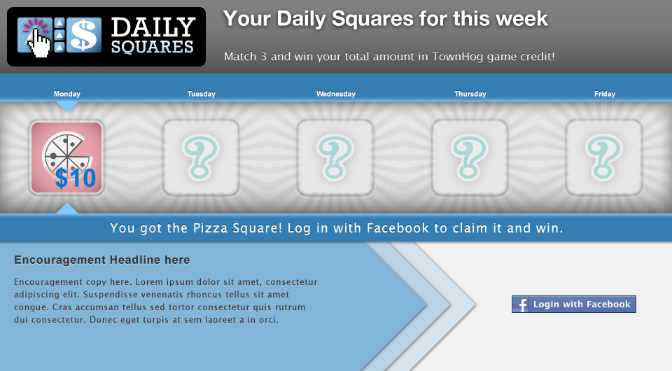
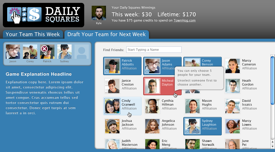
I produced this design and user flow for a Facebook game designed to encourage user engagement and social viral user acquisition for e-commerce websites. To win the game players have to participate each day to build a team that collectively accrues points. The user interface focuses on the leader-board and recruiting additional participants from their social circle to keep people engaged and competitive.
See more in Web and Digital Commerce
Vector Device Renderings
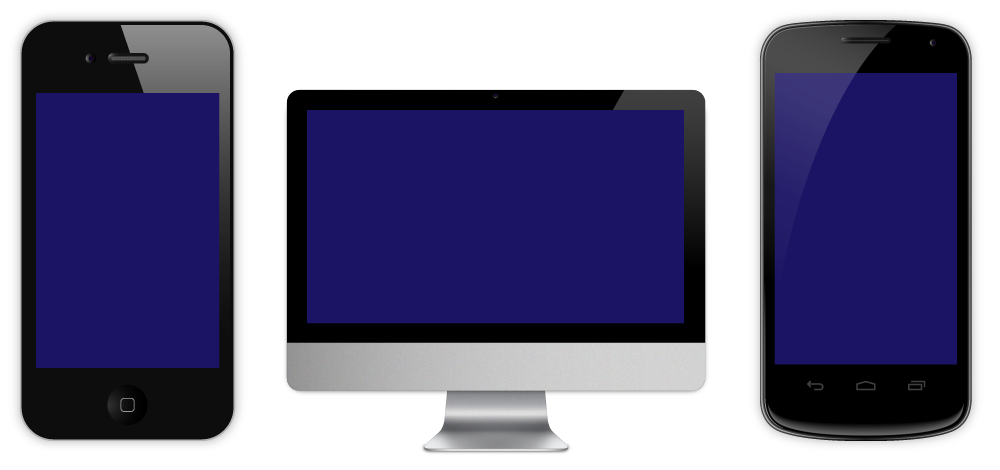
I created these original vector-based renderings for use in comps, illustrations, and marketing materials. They can be scaled up or down to any size without loosing quality and are conveniently packaged as Illustrator symbols, allowing you to drop them into a design at any size. Place your screenshot or mockup into the symbol and voilà, ready to go with an instant glossy iPhone, iMac, or Android phone.
See more in Web
BluLabel Local Offers Widgets
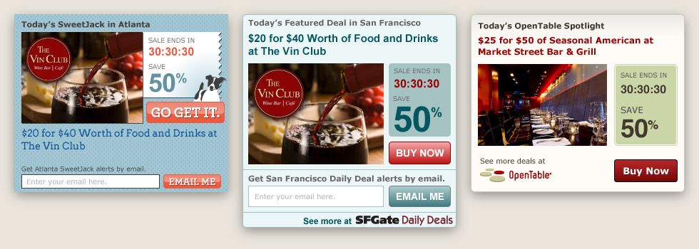
These embeddable widgets were designed for use on online publishing media properties to advertise the daily deal offers of BluLabel’s partners. Each widget was specifically tailored for placement on the partner’s website. Because the widgets were to be deployed primarily by a DOM-injecting AJAX script, special attention was paid to how the widgets were coded to avoid the host site’s CSS from distorting the designs. Each widget incorporates logic to handle each potential deal status to focus on maximum purchase conversion or new user acquisition. One of the first designs I created for this series was A/B tested and proved to have a click-through rate 30% higher than the previous design it replaced. Sweet!
See more in Web and Digital Commerce
BluLabel HTML5 Mobile Website User-flow Documentation
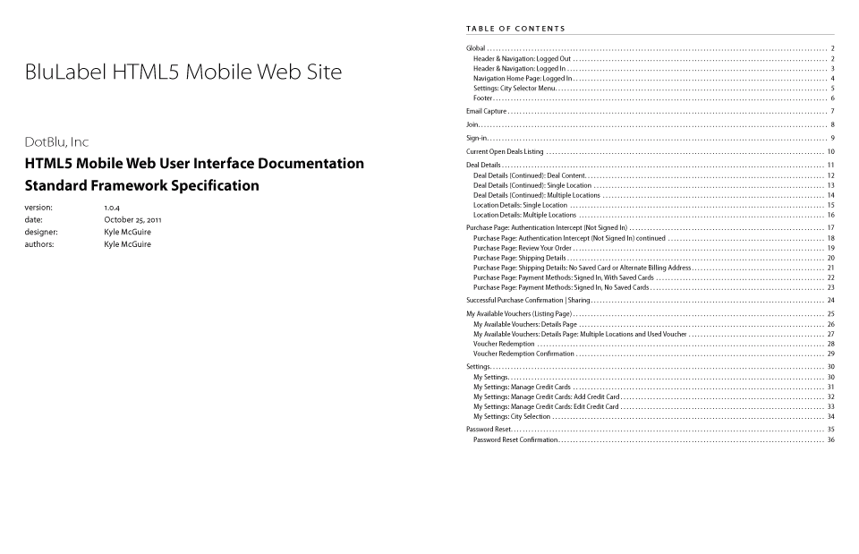
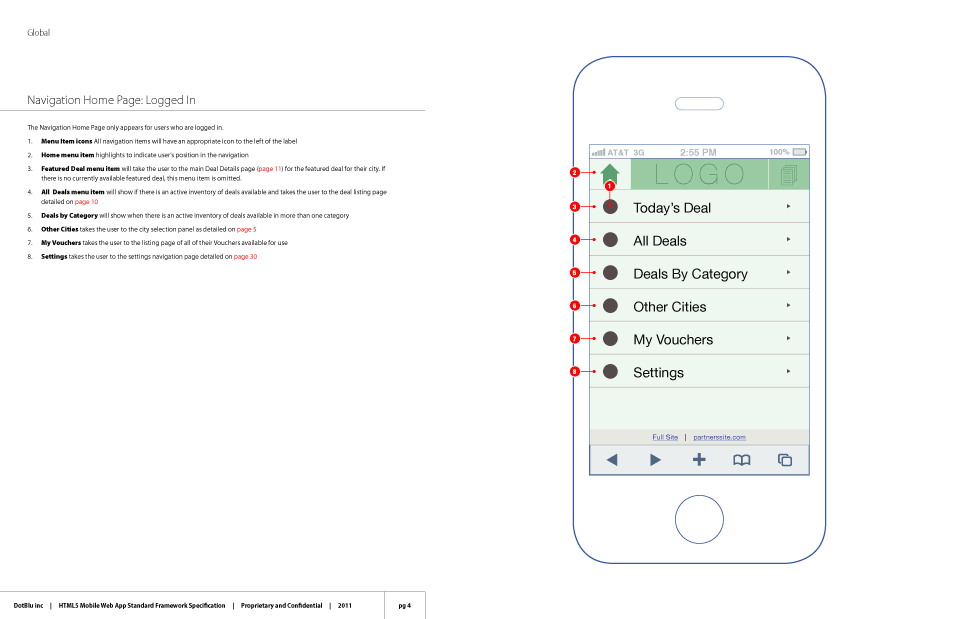
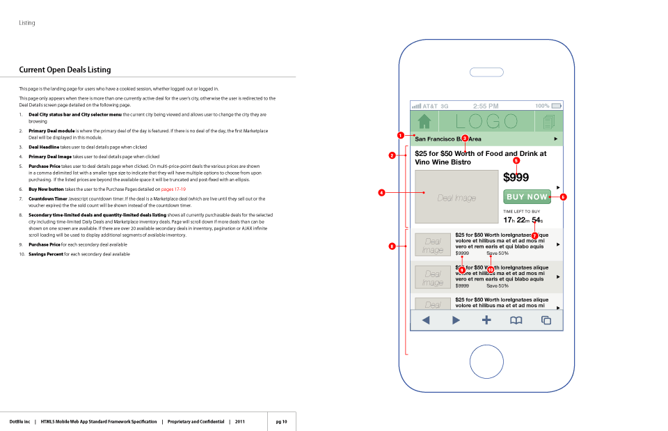
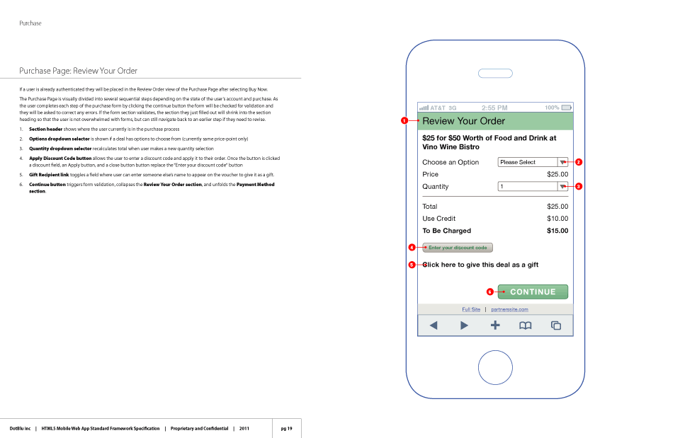
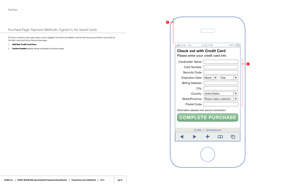
This is an excerpt of the UI specification document that I prepared in order to map out the functionality, user flow, and design of the BluLabel Daily Deals HTML5 mobile website. The document contains a complete page inventory and details on how the UI adapts to different content variations and user-states. The entire document is annotated and cross referenced with notes on how UI components are supposed to function and technical implementation details. The document also acts as a guide to clients explaining what aspects of the app can be white-labeled with their branding and messaging. This project involved working closely with the engineering team members to ensure all the product features would be supported by the mobile API powering the site.
See more in Web and Digital Commerce
TownHog Movies Website
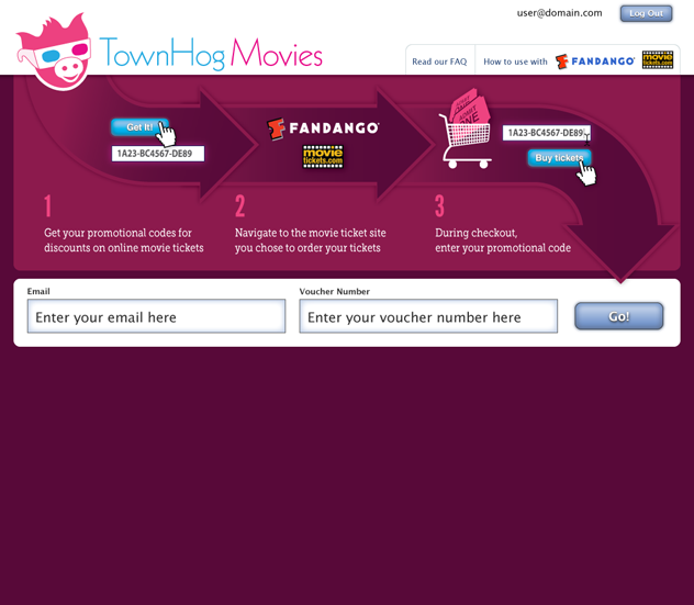
This website allowed customers to claim movie ticket discount codes purchased through promotional offers on daily deal sites. As this was a new purchase model for movie tickets the focus of the user interface was to reduce the user flow to a simple three step process outlined in the primary branding elements. The site brought a great deal to happy customers while offering participating sites a powerful user acquisition tool.
See more in Web and Digital Commerce
BluLabel Website
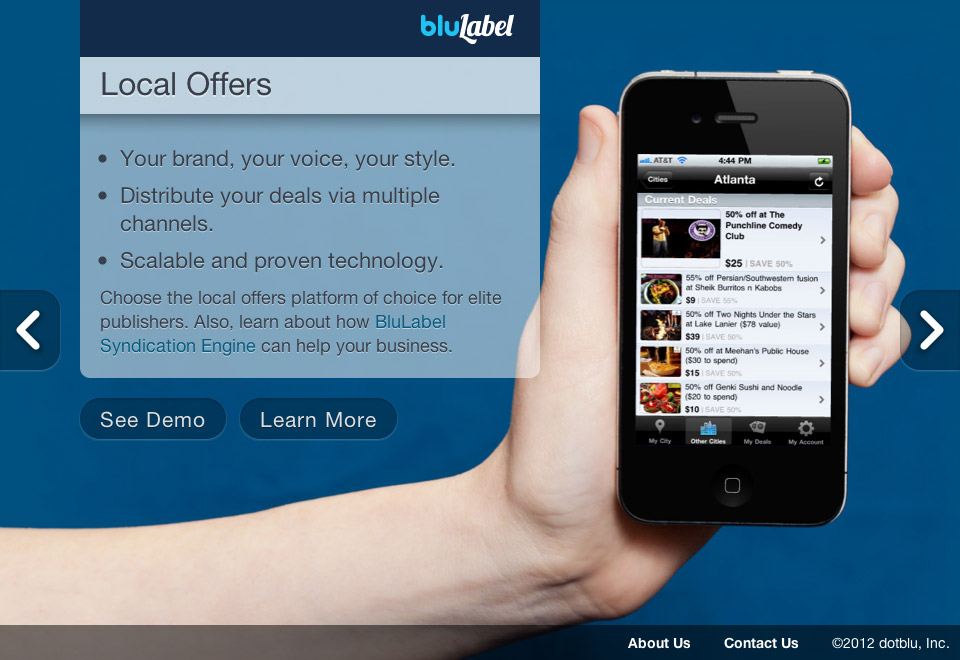
This corporate website was designed to showcase dotBlu, Inc’s web products. The company offered online platforms to power whitelabel Flash Sales, Daily Deals, Local Offers, and user acquisition tools like Facebook-based contests and sweepstakes. Signature images were created for each product line. The site uses HTML5, CSS3, and media queries to optimize the site for various devices. One of the highlights of the creative process was to stage, light, and photograph the mobile apps I’ve designed in action.
See more in Web and Digital Commerce
BluLabel Corporate Identity System
DotBlu, Inc wanted to create a new brand and corporate identity for their product line that focused on their strength as a provider of whitelabel web software. The platform’s strength is the successful melding of technology with clients’ visual identities so the logotype combines a luscious script type with the friendly rounded display serif type used in dotBlu’s corporate logo. A complimentary color pallet, usage guidelines, and a suite of icons and business cards was developed along with the new logotype.
Princeton Arch. Press Pamphlet Architecture Website
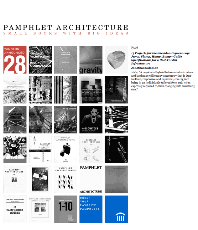
This project involved updating and refreshing the style and coding of Princeton Architectural Press’s Pamphlet Architecture contest website for the 2005 edition. The objective of the redesign was a minimalist aesthetic appropriate for a series of small books focusing on a wide variety of work from emerging and unconventional architects. The website featured online contest entry forms and rules, descriptions of all the past winning entries, and integrated with Princeton Architectural Press’s larger publication catalog site allowing users to purchase publications of previous winners’ work.
California College of the Arts Alumni Giving Identity System
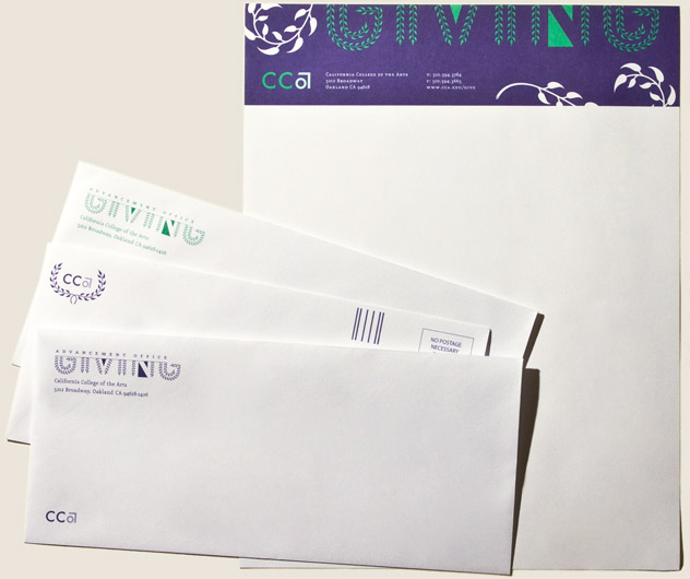
This new identity system was designed for The Advancement Office of the California College of the Arts’ fundraising campaigns. The campaign funds the school’s merit scholarships. After initially exploring several design directions the client and I decided to use the laurel wreath as the central motif of the project. To appeal to the school’s visually astute alumni the classical symbol of academic achievement is rendered in a modern style.
The identity system is used in a variety of direct mail pieces and the Advancement Office’s campaign letterhead. The client has been so pleased with the result that it has been in use for over four years.
See more in Identity Systems and Education
San Francisco Architectural Heritage Posters
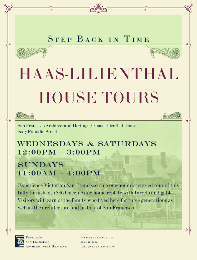
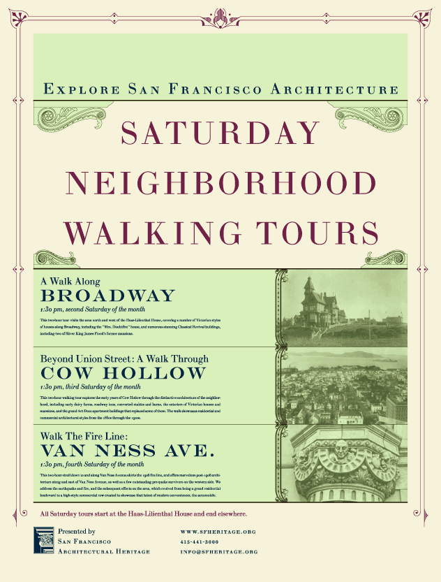
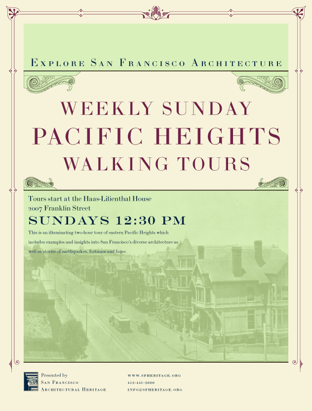
I designed this series of large format posters to help San Francisco Architectural Heritage promote their neighborhood walking tours and the docent-lead tours of the their historic house museum, the Haas-Lilienthal residence. The posters use photos from Heritage’s archive and 19th-century-style typography to allude to the history people will experience on the tours.
American Decorative Arts Forum Ad Campaign
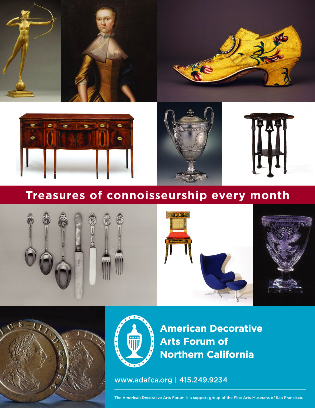
I designed this full-page magazine ad to promote the ADAF lecture series. The ad focuses on key objects from the various speakers’ programs to highlight the diversity of topics and styles featured in the series and uses an unconventional red, white, and blue color palette to allude to the focus on classic American design while still looking fresh and modern.
